I love how you can customize the reader toolbar to suit our preferences to any quick action we want. It does feel like it’s a bit more of effort to do any action outside of those quick actions.
Currently, you have to change the quick action to something else, tap it again, then really lose your quick action. Or go back to the inbox view, swipe, tap more, then choose your option.
It would be great to simply add a 6th icon to use the overflow menu which shows all of the options, similar to the more option when you swipe in the inbox.
An overflow icon could be nice at the top too, but is harder to reach 
Thanks for listening!
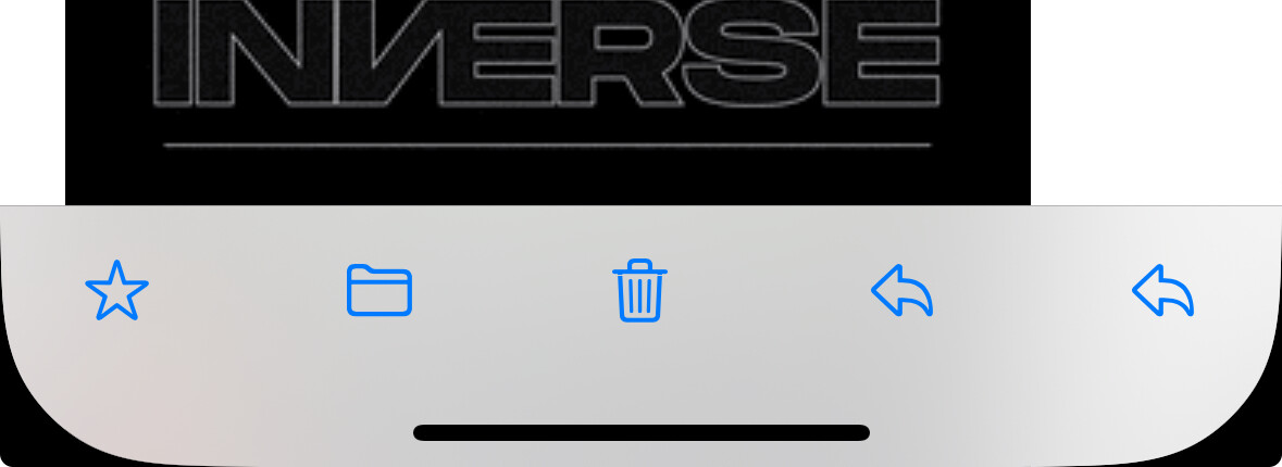
Thanks for the feedback! You can tap the “Reply” icon in the lower right and that will bring up the more sheet with all the same actions.
There’s a question mark whether it’s obvious the “Reply” icon brings up the more sheet (I’ve just gone with what Apple has done in Mail).
Open to other suggestions though!
Ah it is there! This is exactly what I was referring to.
I think I got confused because the visual affordance is exactly the same as the reply icon. Personally, I would associate the more sheet with the overflow icon, three dots with a circle. Same as what you use in the top right of an inbox.
Right now if I want reply as a quick action, I end up getting two of the same icons representing different functions.
Definitely agree when presented like that it looks a bit confusing!
Let’s try it with an ellipsis in the next build and see what people think 
You’re quick! Looking forward to the next build. Keep up the great work
It looks like the more/overflow menu is now showing a chat icon with dots in v47. Was this intended?
I actually prefer the chat icon.
Intended! Trying out a few variations after some feedback. The thinking was to combine the ellipsis and reply. Not settled on it yet and have a few others to try.
1 Like