The color coded icons when viewing emails that corresponds to the color of the smart box is really fun! although, some of the colors that match the inbox end up having very low constrat.
It would be great to have a default color (maybe even chosen) for the icons in the email reader while keeping the color coding for the smartboxes when viewing the home screen.
Thanks for considering 
If you come across any low contrast examples and don’t mind sharing I’d love to take a look! Big Mail should be using a contrast of 7:1 on the toolbar / background.
You can disable the message reader tinting in Settings > Appearance > Reader > Tint. Then the reader will use the colour of the Smartbox instead. 
The smartbox color is what I’m referring to I have disabled the reader tint for this same reason.
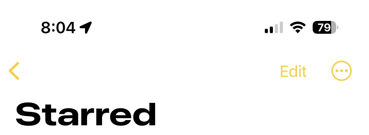
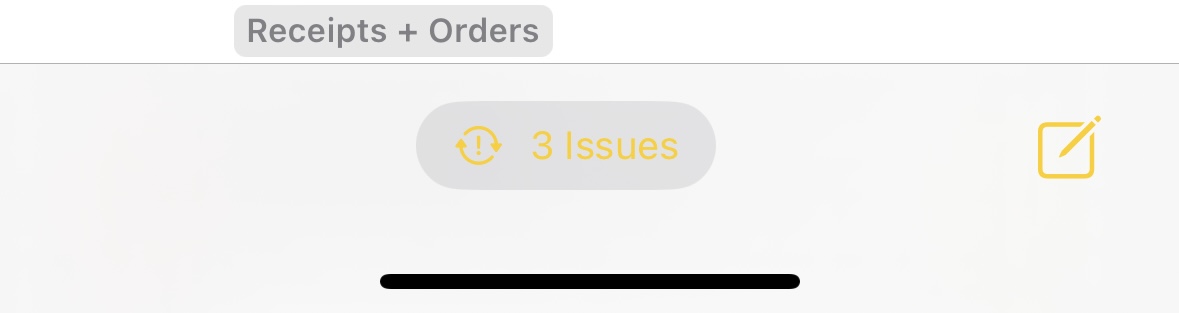
I like the color codes for differentiation in the homescreen, but becomes problematic in the email reader. The yellow starred is a good example of this. See attached.
I know I can change the color of the smart box, but I really do like the color indicators on the home screen.
Ahh I understand what you mean now. Yes the yellow on white is a bit problematic (grey in Attachments too).
Will take a look at tweaking the light mode variant of these colours.
Thank you! I’ve also noticed a similar contrast effect in dark mode. I know it’s probably low on the priority, but being able to set a consistent color in the reader that isn’t associated with the smartbox color tinting would be great.
1 Like